Skip to content
BeeDee

A consumer app, owned end to end

BeeDee felt like a website in a wrapper. I made it native, then spent more work on the signup flow than on anything else, so people stopped falling out of it. Refer-a-friend, travel mode, localisation, and releases moved onto GitHub Actions. It cannot buy ads on Meta, Google or Reddit, so organic search had to carry the growth, and daily clicks are up 84%. Reporting to the CEO, with the team in India.

BeeDee did not need to be faster. It needed to stop feeling like a website in a wrapper. So the first stretch was the native look: React Navigation headers instead of custom ones, SF Symbols in the chat inbox on iOS, and the image, list, toast and carousel libraries all swapped for ones that behave the way the platform does.

Then the signup flow, which turned into the single biggest thread of the whole engagement: more separate pieces of work than anything else got. Your answers survive going back to change your phone number. The BDSM test result you already added is still there when you resume. The safe-search choice persists through an interrupted signup. None of that is a feature anyone asks for. All of it is people not falling out of the funnel.

After that it was growth and the plumbing under it. Refer-a-friend for Superlikes and Supporter, the Superlike and Supporter purchase screens redesigned, and the Play Store screenshot set generated from the app itself rather than mocked up by hand. Travel mode, localisation, crash reports carrying the account context so a stack trace names a person, and GitHub Actions taking over the releases.

Growth had to come from somewhere else, because the platform is barred from paid advertising on Meta, Google and Reddit. So it came from search. Daily clicks are up 84% over the last five months, 954 non-brand queries rank, and 83 of them sit in position one. The best of those is bdsm test app at position 1.3, which is the kind of term that brings people who are already looking.

Frontend lead since the start of 2025, owning the codebase end to end, reporting to the CEO and working with the engineering team in India.
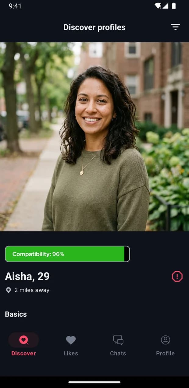
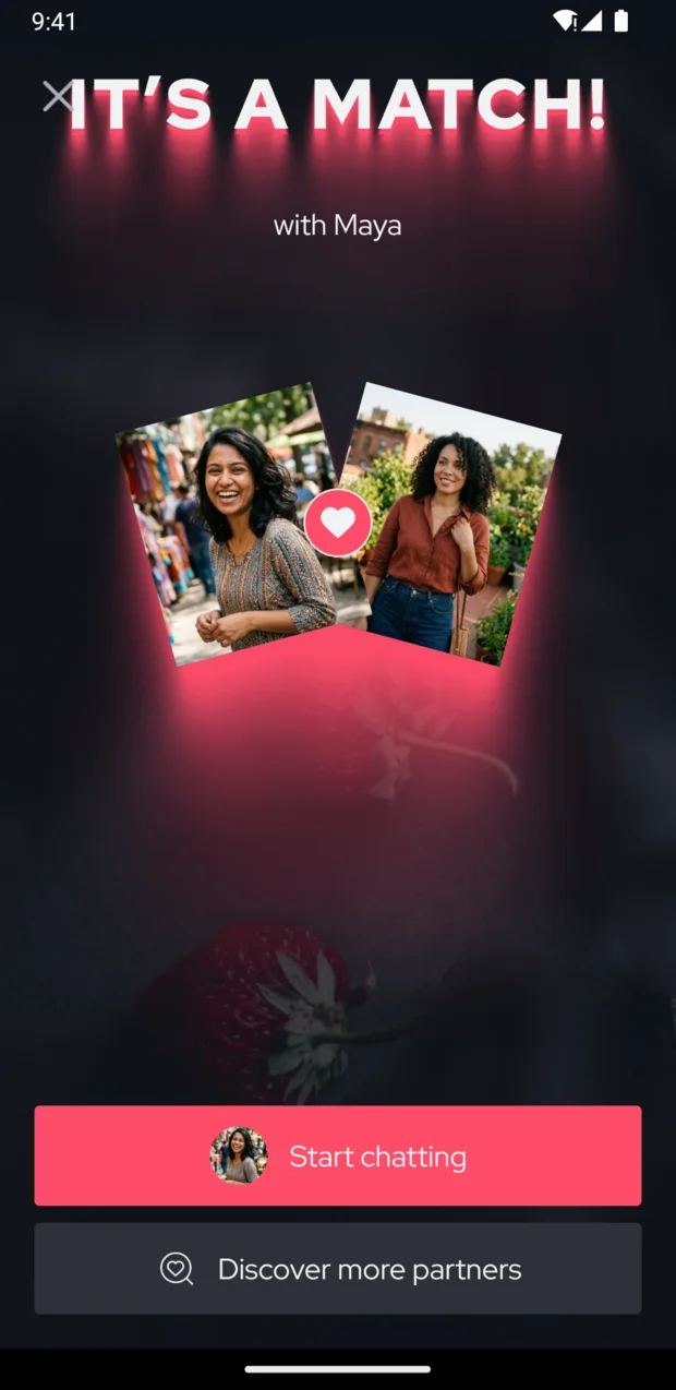
What I shipped

  • Travel Mode, passport-style redesign
  • Incognito mode
  • Refer-a-friend for Superlikes
  • Share your profile with a link
  • Supporter upgrade with duration toggle
  • Superlike purchase screen
  • Unread counts per conversation
  • Same-country filter
  • Store screenshots generated from the app
  • Metro to Expo migration
BeeDee on iPhone
BeeDee on iPhone
BeeDee on iPhone

BelgiumIndiaBelgium, with the engineering team in India

In the app

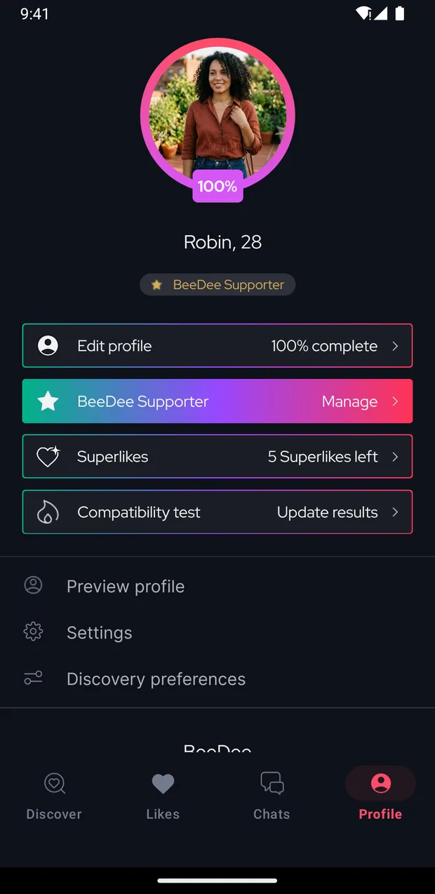
  • Supporter, Superlikes and refer-a-friend, all off one screen

    Supporter, Superlikes and refer-a-friend, all off one screen

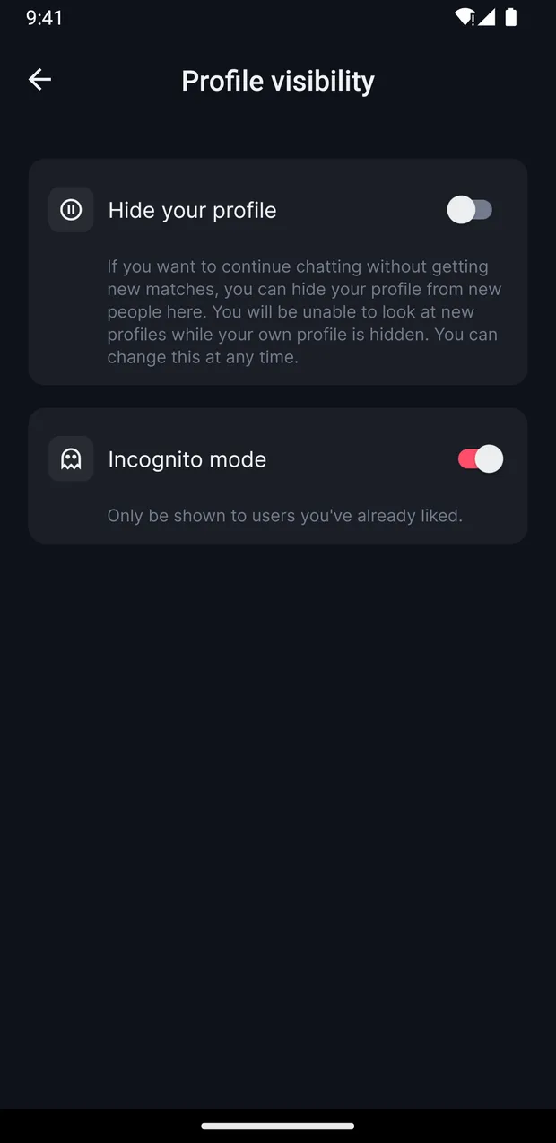
  • Incognito, so you only surface to people you already liked

    Incognito, so you only surface to people you already liked

  • Travel mode, with the places you keep going back to

    Travel mode, with the places you keep going back to

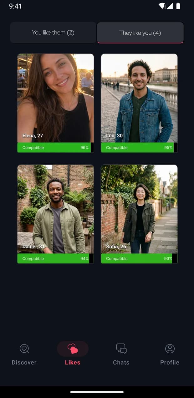
  • Who liked you, kept separate from who you liked

    Who liked you, kept separate from who you liked

Where it landed

+27%

monthly active users across 2026

+84%

daily search clicks over five months

83

non-brand queries ranking in position one

What it taught me

The unglamorous flow is where the users actually are. More work went into signup than into any feature, and none of it is something a person would ever ask for. Keeping your answers when you go back to change your phone number does not demo well. It just means people finish.